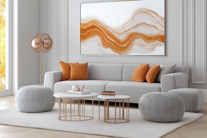
Discover the top 7 paint colors and design tips to instantly make your home appear more spacious and bright. Learn how to use color psychology and clever accents to open up any room.
A small or dimly lit space can feel oppressive—unless you know the power of the right colors. By choosing shades that reflect light and create visual continuity, you can make any room feel significantly larger and brighter. Here are the top eight colors that designers swear by to open up and illuminate your home.
1. Crisp White
White is the classic go-to for brightening a space. It reflects the maximum amount of light, which helps rooms appear larger and more open. Whether you prefer a warm-toned white for coziness or a cool-toned white for a more modern, crisp feel, this hue can instantly transform a room.
Pro Tip:
- Pair white walls with natural textures—like wood, rattan, or stone—to prevent the space from feeling sterile.
- Layer in varying shades of off-white (cream, ivory, or beige) for subtle depth.

2. Soft Gray
A light, neutral gray is a sophisticated alternative to white. It provides subtle contrast without overpowering a room. Grays with warm undertones can add a cozy feel, while cooler grays lend a modern edge.
Pro Tip:
- Keep furniture in similar soft neutrals for a monochromatic palette that visually expands the room.
- Use bright accent decor (like colorful pillows or artwork) to prevent a monotone look.

3. Pale Blue
Channel the calming effect of the sky and sea with a pale, breezy blue. This color is especially effective in bedrooms or bathrooms, where a tranquil atmosphere is essential. Pale blue walls tend to recede visually, making a space seem larger.
Pro Tip:
- Pair pale blue with crisp white trim for a fresh, coastal vibe.
- Incorporate touches of green or yellow for a vibrant pop that complements the cool blue tone.

4. Subtle Pastels (Blush or Mint)
Pastels like blush pink, mint green, or lavender can brighten a room while adding a subtle hint of color. These shades are perfect if you want something more playful than neutral but still light enough to reflect natural and artificial light.
Pro Tip:
- Coordinate pastels with white or gray furniture to maintain a balanced, airy feel.
- Use metallic accents—like rose gold or brushed brass—for a chic pop of glamour.


5. Warm Beige or Cream
For those who love a cozy, inviting atmosphere, a warm beige or cream can do wonders. These shades reflect lightalmost as effectively as white but introduce a softer, more welcoming tone. Perfect for living rooms and hallways where you’d like a warmer feel.
Pro Tip:
- Opt for slightly darker trim in a complementary color (e.g., taupe or mocha) to add visual interest without shrinking the room.
- Incorporate natural elements—like a jute rug or rattan chair—to enhance the earthy vibe.

6. Light Taupe
Light taupe provides a gentle, earthy backdrop that’s both modern and versatile. It’s deeper than beige but still reflects plenty of light. In the right lighting conditions, taupe can create a plush, calming atmosphere that pairs seamlessly with warm metals and natural textures.
Pro Tip:
- Combine light taupe walls with brushed brass fixtures or copper accents to add a hint of luxury.
- Use varying shades of taupe for furniture or textiles to maintain a cohesive, layered look.

7. Soft Yellow
Soft yellow hues, like buttercream or lemon chiffon, bring warmth and positivity into a room. They can be especially helpful in spaces lacking natural light, making the environment feel sunnier and more cheerful.
Pro Tip:
- Balance out soft yellow with cool neutral furnishings (gray, white, or black) to avoid an overly bright look.
- Incorporate natural textiles (like linen curtains) for a relaxed, breezy feel.

Final Thoughts
Color is a powerful tool in interior design, especially when you aim to make a room feel bigger and brighter. Whether you gravitate toward crisp white or a soft yellow, choosing the right shade can dramatically transform your space—no major renovations required. Pair your chosen hue with strategic lighting, minimal clutter, and well-placed decor to maximize the illusion of openness.


